
 Ok this is the starting sketch. Usually I thumbnail my comics out first but with this one I wanted to do it in a graff art style and just attack my page. The trick to doing this graff style for a comic is in controlling your lines. Done right the lines will direct the viewers eye to where you want them to be looking. Also it must be one image not a whole heap of separate things. Overlapping patterns and shrapnel can tie your stuff together.
This is the first time I've really gone all out in this style so I dont know if it is quite there yet but I do like it The inked piece. Inking is something I think I'm getting better at (I only really started doing this last year). This was all done by hand, using a light table, ipod on shuffle, good inking paper, a 0.1, 0.5 and a brush pen. Inking is really an art form in itself. Using the right line weights can really bring stuff off the page or push it into the background. Also you can be dynamic with shadows and be a little loose with your light source. Adding dirt scratches to white areas also softens the image. I'd love to do some of the cool tricks Tim Townsend does but I need to practice a hell of a lot more.

Ok before I started colouring I had to clean up my lines. Fix some overflows and areas not completely coloured black. I then had to fix a typo. This is always a pain but doing some cut and pasting it's a 5 minute job. I based Robot's colours on the best robot of them all GIANT ROBO. I'm using a pinkish background to make it a bit more fun. I'm not too sure about that gradient, we'll see if it stays or not.

Not much done today as I'm busy doing Porcelain stuff. The bright colouring is working pretty nicely. Before I started this comic I watched "Dead Leaves" for inspiration. Man that's a good film. there's a few colours (Go!, numbers and shapes in the 3rd panel) that I'll be wanting to add some glows too later on. I may flatten the image and copy and paste those areas out. I'm not too sure yet.
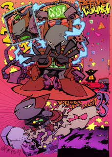
Ok it's done. I copied out all the colours I wanted to glow on an above layer then gaussian blurred them and set the layers to Add. I dulled the opacity a bit to control the glow. I then used Faux film filter and adjusted the temperature and added some grain and added a slight glow. I then went into Hue and Saturation and dropped the saturation a bit and tweaked the hue. As I was about to save I thought I'd try (my favourite filter) sunset and twilight this puts a coloured gradient over the image. I liked how it made the bottom half have a blue tint and brought the top up to being more yellow.
So this image didn't have too many tricks to it and I coloured it pretty flat with no highlights or shadows. There's bits I'd like to change (like the edges) but it's best to move on to all the other things I have to do
4 comments:
I like that you took us through step by step. Very informative, Tim. On a tangent, though, the best robot of them all is Gigantor. But then I'm old school (so old school that I spell it 'school')
gigantor is pretty cool. Giant Robo is just as old school.
http://en.wikipedia.org/wiki/Giant_Robo_%28tokusatsu%29#GR:_Giant_Robo
There's some great live action shorts I'd love to check out of both these series
http://gr-anime.com/english/about_history.html
And you'll find out here that Gigantor and Giant Robo was created by the same man
Mitsuteru Yokoyama
That is hella excellent Tim. Really, really good looks so pro. BRING IT
Post a Comment